

BRAND IDENTITY DESIGN
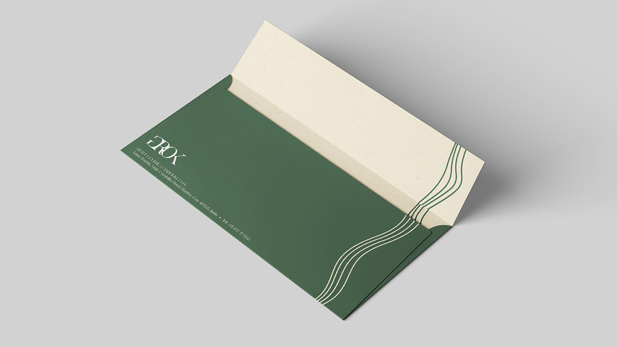
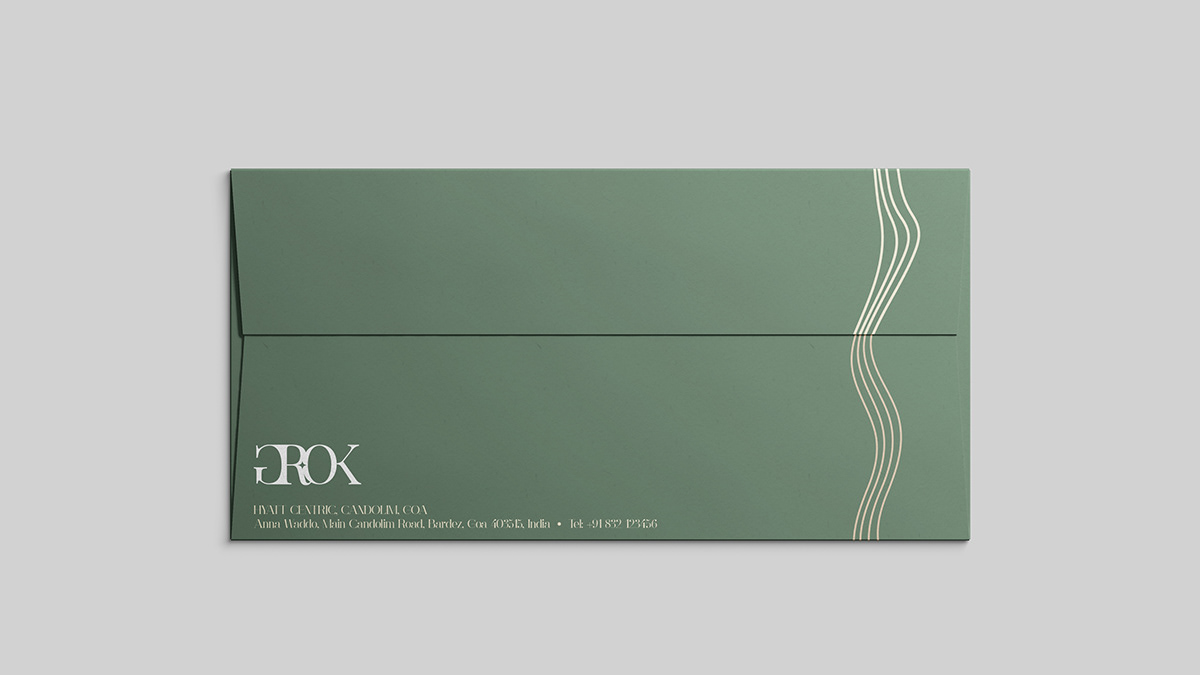
GROK | Hyatt Centric Candolim Goa
Grok is the signature restaurant & bar that has comfortable indoor and alfresco seating with flooding natural light, three communal tables and aesthetics that carry the laidback Goan vibe. A casual evening setting led strongly by mixology & beers, revolving around Persian & Indian kebaberie with oven based cooking.


The literal meaning of GROK
The Oxford Dictionary summarizes GROK as “to understand (something) intuitively or by empathy.” It is one of the highest forms of understanding. It is so high that when an observer groks something, he becomes a part of the thing being observed.
The Concept
The culinary offering is not defined by a cuisine. In fact, it groks several global and traditional cooking styles like open-flame cooking, rustic baking, old fashioned grills, etc., to give rise to an offering that’s artisanal and contemporary at the same time.
The beverage program groks several concepts like the retail experience of Goan & other global wine shops, country-side artisanal breweries and the personality of a celebrity mixologist. Local Goan towns are made to grok spirits, resulting in quirky cocktails.
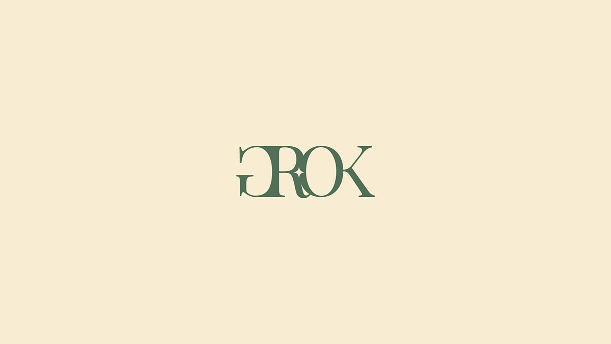


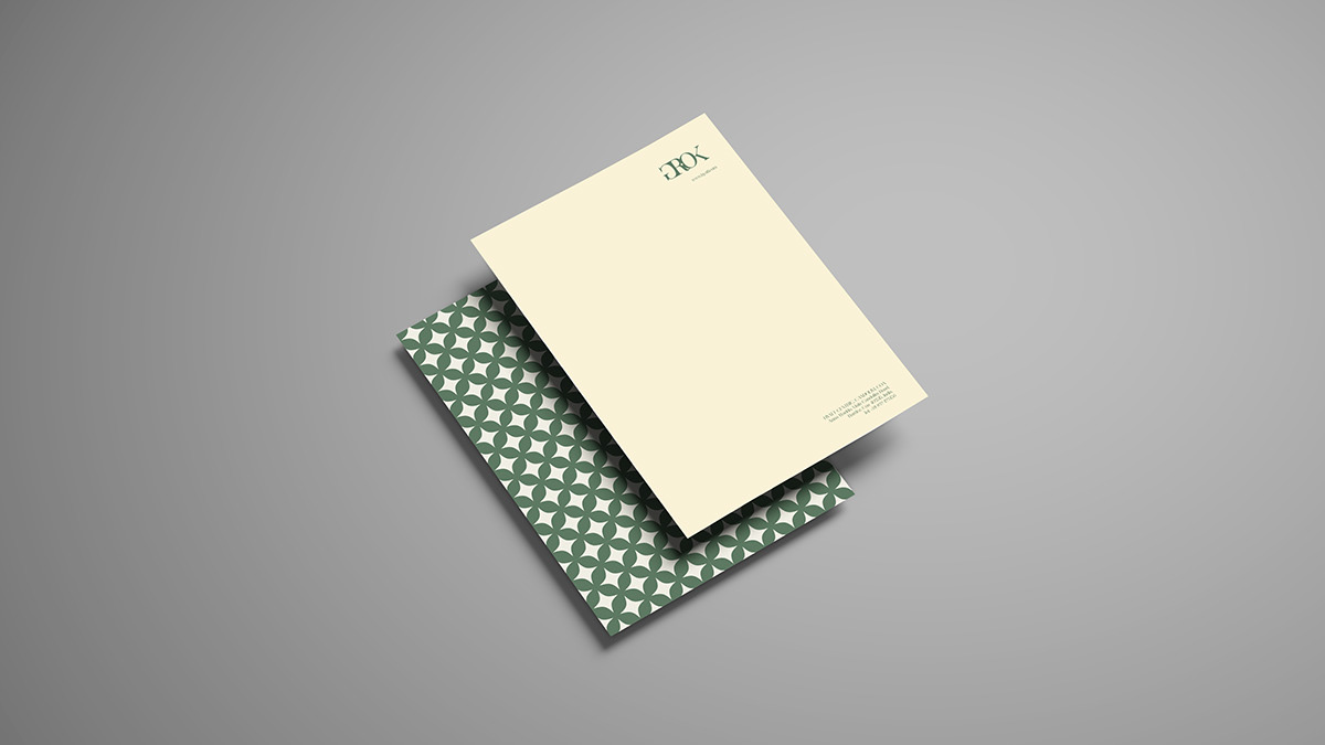
The LOGO
The logo formation takes inspiration from the definition of GROK. Alphabets have been made to GROK each other, hence they appear to have new perspectives and they all seem connected as one unit. The serif style takes inspiration from an older era. The font-play makes it appear contemporary. More importantly, the logo brings in the aspired identity.
All-in-all, the restaurant GROKS several experiences to create one multi-dimensional experience.
Since the term ‘GROK’ seamlessly defines the restaurant, we used the definition itself as an inspiration for the identity. Every piece of communication subtly reminds the viewer of GROK (either through text or through design); making GROK memorable.
The logo does not define any one particular service (the logo represents the entire concept as a whole), it does not simply contain elements of food or a restaurant.
Fresh | Flexible | Young at heart | Approachable luxury | Contemporary meets tradition


The GROK Poster Series


The GROK-A-DOODLE Series
The series also strives to create a pseudo-GROK experience. At a glance, the connection between each of the individual artworks (within a given series) is invisibly seeded inside the viewer’s mind. This experience is distantly similar to GROK [to understand {something} intuitively or through empathy].
In the Unwind series, the Illustrations aim to re-iterate the philosophy of the food menu (i.e., Unwind). Once you look at all the illustrations, you'll GROK the concept easily. You'll get a pseudo-feeling of GROK. Additionally, all the illustrations eventually mean one thing or form one thing (something very similar to GROK).


The GROK-A-DOODLE Unwind series
In the Revitalise series, the illustrations aim to re-iterate the philosophy of the beverage menu (i.e., Revitalise). The reader/glancer once again gets a pseudo-GROK experience. When the reader simply glances at one illustration, he/she sees it as a 'doodled process.'
However, the viewer soon gets the connection after looking at the series as a whole. The viewer gets a pseudo-feeling of GROK. Additionally, all of the illustrations eventually lead to one thing (something very similar to GROK).


The GROK-A-DOODLE Revitalise series


